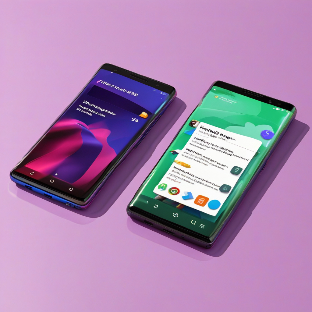
In the realm of Android development, change is inevitable. Google’s rumored UI overhaul for Android 16, particularly with the introduction of Material 3 Expressive, might stir up some mixed feelings among users. While initial beta versions may not reveal the full extent of the transformation, deeper explorations hint at a shift that echoes elements from iOS.
One notable alteration lies in the combined notifications and Quick Settings panel. Despite veering away from a rumored iOS-style split menu, Google seems keen on incorporating resizable Quick Settings tiles and a category-based organization system. The introduction of semi-transparency, evident in various menus like the app tray and PIN entry screen, adds a touch of iOS-inspired design with heavily blurred backgrounds.
Moreover, Google is experimenting with fresh icon designs and menu layouts. Stand-out icons in the status bar and colorful icons within the Settings menu aim to enhance visual appeal. The addition of new icon shape options and the restructuring of menu items into distinct cards offer users a more diverse aesthetic experience.
Changes extend to the lock screen widget and notifications, with a focus on centralizing information and providing discreet previews until interaction. The volume UI screen is also undergoing refinements, featuring thinner volume bars and a more squared-off design—a departure from the rounded style of Android 15.
While Material 3 Expressive may not signal a complete UI overhaul, it promises a substantial revamp of the Android experience. As Google draws inspiration from different design approaches, users can anticipate a fresh look and feel that aligns more closely with contemporary design trends. Stay tuned for further updates as Android 16’s development progresses.

